Creepy Dates Walkthrough
Creepy Dates is a horror dating sim that never once announces itself as one. It opens on a candlelit table for two - one menu, two chairs, and a match whose profile photo is older than the city. A polite vampire who never blinks. A werewolf who keeps rearranging the silverware. A siren whose voice sounds like a long answer to a question you did not ask. Then it very slowly removes the difference between a date and a trap.
What follows is a scene tour built from the game's real in-game frames, not a route guide. The captures below show the two things worth understanding before you sit down: how a choice is presented, and what the interface offers while you are reading.
The Face Across The Table
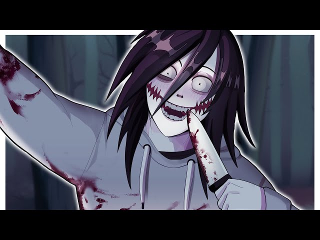
The strongest single image the game produces is a close portrait: dark hair falling across a face with one eye wide and staring and the other squeezed shut, a mouth stretched into a grin that is smeared with blood, and a raised hand with blood running down the wrist. The background is a blurred forest in cold blue-green tones.
It is framed like a photograph in a gallery viewer rather than a live dialogue box, which is roughly how the game presents its most important imagery - it hands you the moment and then lets you sit with it. The blood here is part of the visual language, not a shock beat. Nothing in the frame moves.
How A Choice Actually Looks
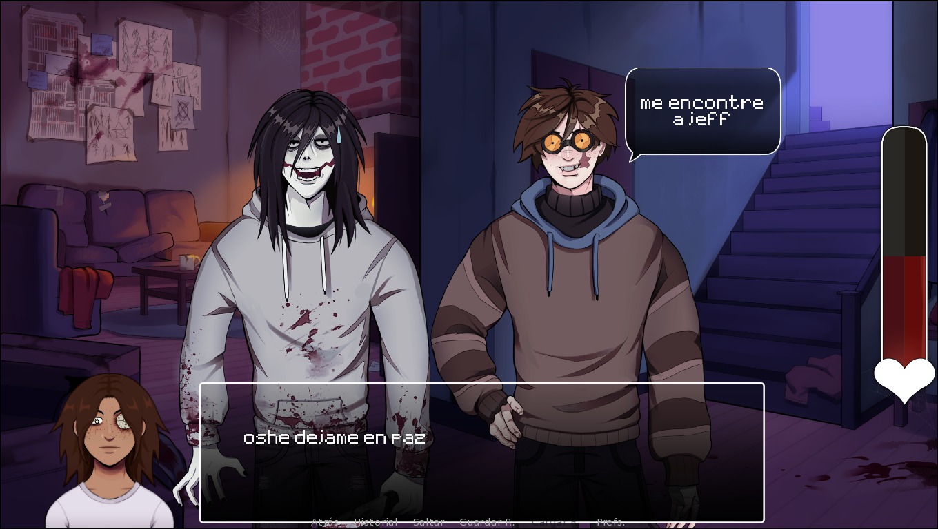
The second capture is the one that matters most for playing well. Two characters stand facing each other in a dim room - one in a stained white top, the other in a striped sweater - and a speech bubble sits over the one who is speaking. A choice prompt is open in the middle of the screen, ready to pick from.
The most interesting element is on the right edge: a vertical meter filling with blood, topped by a heart. It sits outside the dialogue box and outside the choice prompt, so it is always visible while you decide. That is the game's whole thesis in one UI element - the closer you get to what you actually want, the more of yourself the date has.
The Controls, As They Appear In The Build
The bottom bar in this build is the full Ren'Py set, and it is more complete than most games of this size bother with: History, Hide text, Skip, Auto, Save, Load, Quick Save, Quick Load and Preferences. Quick save and quick load on the same row mean a bad choice can be undone immediately rather than by replaying a whole date.
Everything is click or tap, so it works on a phone. The dialogue boxes and close-up portraits are designed for a wider screen though, so fullscreen on a desktop browser is the comfortable way to read. Progress saves locally in your browser.
- Advance dialogue with click or tap - there is no separate confirm key to learn.
- Hide text clears the dialogue box when you want to look at the character art unobstructed.
- Quick Save and Quick Load sit together, so a misread answer does not cost you a full route.
- Preferences holds text speed, auto-advance timing and fullscreen - worth setting before a long sitting.
How To Read A Date
The game does not treat every decision as a giant neon fork. Most of them are small: how long to hold a gaze, how honest to be about what you want, whether to order the second glass, whether to ask what the date actually is. The writing gives you room to read a flirty line twice and notice that the verb changed.
That is the practical part of playing it well. Slow down on the lines that sound charming, watch which question the date keeps steering you toward, and remember that small choices matter because the dinner is keeping track of them. There are multiple dates and several endings, so a second run with a different instinct is usually more instructive than the first.
Tips before you start
- Quick Save before every choice. This build puts Quick Save and Quick Load on the same bar, so a bad answer costs you seconds rather than a whole date.
- Watch the blood meter on the right, not just the dialogue. It fills outside the choice prompt, so you can see it while you decide.
- Use Hide text when you want an unobstructed look at a portrait - the game rewards paying attention to the faces.
- Set text speed and auto-advance timing in Preferences before you start. The writing is unhurried and the default pace is slower than it feels.
- Play in fullscreen on a desktop or tablet. The dialogue boxes and close-up portraits are built for a wider screen.
- Do not treat the first route as a puzzle to solve. Answer with a consistent instinct, then change one thing on the second run and see who moves.
Built from the game's real in-game captures - scene tour and tips, no invented plot.